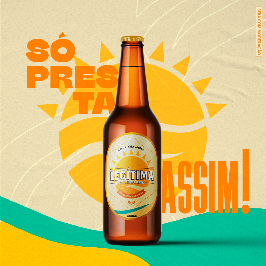
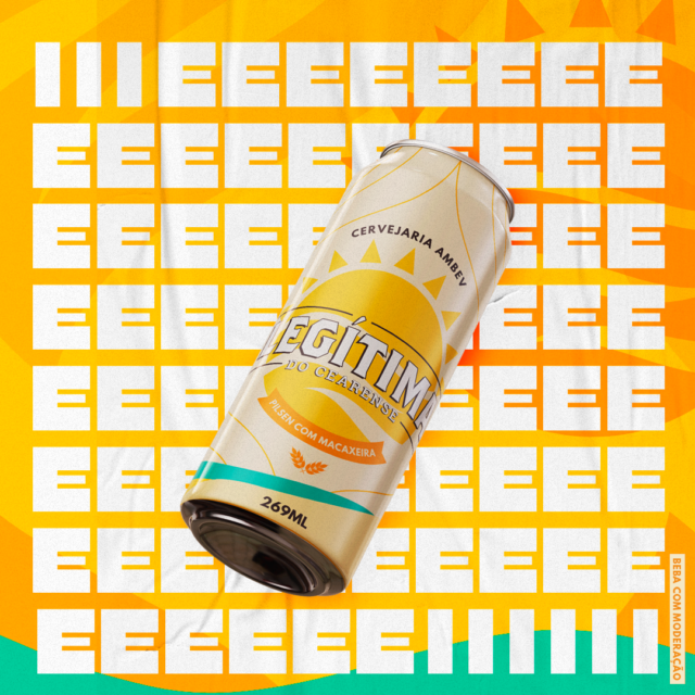
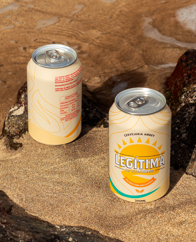
Reinforcing local identity and affective memory through beer
By using sophisticated visuals, we were able to express this business’s purpose and drive their costumers towards their vision of becoming a snarky wine bar for the suburban upper middle class mothers.
This removal of ego allows their clients to feel heard and respected, allowing for creativity to flourish.
Visual communication
Digital Revolution
Designed in the style of the original Dingbats, these symbols allow for a variety of compositions, forming a simple and powerful graphic backbone.
It showed a lady fitted out with a fur hat and fur boa who sat upright, raising a heavy fur muff that covered the whole of her lower arm towards the viewer.
Gregor then turned to look out the window at the dull weather. Drops of rain could be heard hitting the pane, which made him feel quite sad. “How about if I sleep a little bit longer and forget all this nonsense”, he thought, but that was something he was unable to do because he was used to sleeping on his right, and in his present state couldn’t get into that position.
This project was a refresh and brand packaging design for a famous beer on Brazil, the brand uses a visual language that is both contemporary and traditional. The strategy was all about targeting a specific region and its sayings to create a special connection with the consumer.
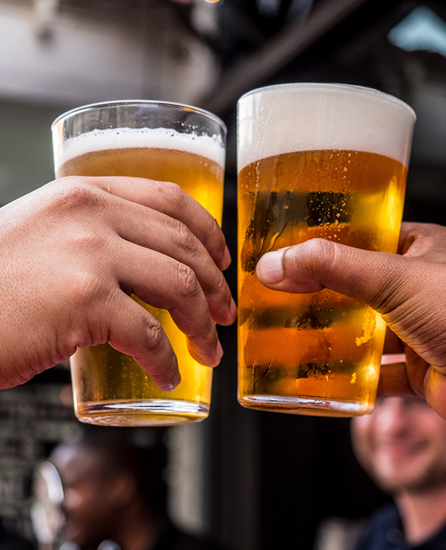
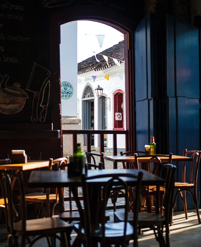
With this renewed and fresh look, every customer was able to feel excited about choosing this as the place for their not-so-often time spent social gathering. .